Logo launch unleashes backlash
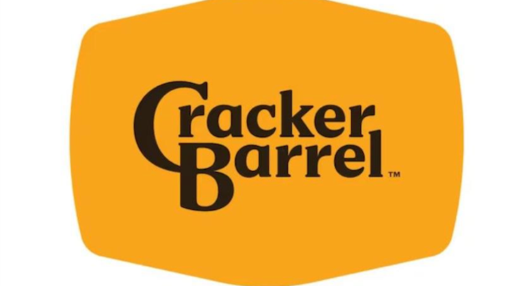
Critics are coming for Cracker Barrel’s new simplified logo, which removes the image of a man leaning against a barrel and the phrase “old country store,” states a post on MediaPost.
“The identity refresh also includes new TV commercials, a redesigned menu and several new fall-themed foods, part of a larger $700 million transformation plan to shake off its stodgy image and lure in new diners,” according to CNN Business.
Cracker Barrel says the refresh will still maintain the brand’s “rich history of country hospitality” and that the colors in the logo were inspired by the chain’s scrambled eggs and biscuits.
“But within 48 hours, the redesign backlash was raging online, with commenters on both sides using it as a cudgel,” according to The Washington Post.
Some social media users criticized the new logo, especially those in conservative circles. states MediaPost.
“The president’s son, Donald Trump Jr., amplified a post on Wednesday suggesting that the logo change was led by CEO Julie Felss Masino to erase the American tradition aspect of the branding and make it more general, as a way of leaning into diversity, equity and inclusion efforts,” according to CNBC.
Conservative activist Robby Starbuck added his commentary on Thursday, writing in a post on social media site X, “Good morning @CrackerBarrel! You’re about to learn that wokeness really doesn’t pay.”
Cracker Barrel shares fell sharply Thursday before recovering somewhat, ending the day at $54.80, down nearly 7.2%.