

")
By Johanna Daproza, Director of Creative Services at TalentMEDIA Services
What’s in a name? Well, if your font name is Clearview, I’d say it’s pretty obvious.
Apparently, the federal government has decided otherwise. Since 2004, the Federal Highway Administration has been updating highway signs using the Clearview font instead of the long-used Highway Gothic font. But for the past few years, FHWA has debated reverting back to Highway Gothic. What’s the big deal, right? Well, as someone who looks at fonts all day long and has created everything from postcards to billboard signs, this is a REALLY big deal. It’s the difference between being able to clearly read highway/street signs from a distance, especially at night, and not being able to. The main difference between Clearview and Highway Gothic is that the former is a serif font (the letters have little feet and handles at the ends of the letter lines) and the latter is a sans serif font (the letter lines truncate without little feet and handles). More people need to understand that there is a big difference between a serif and a sans serif font. And font sizes and styles really do matter.
As we age and our eyesight changes, our eyes tend to see fonts differently. Just the right/wrong curve or a bold or italic typeface can make a font difficult to read. Depending on what fonts are being used, a lowercase “g,” “p,” or “q” can easily get mixed up—as can the lowercase “a,” “c,” “o,” and “e.” For uppercase letters, you have to think about “E,” “F,” and “P” or “D,” “C,” and “O.” These are all letters that tend to get interchanged with one another when your eyesight is not the best. Just ask your local optometrist. It’s why your basic vision test (developed by ophthalmologist Herman Snellen in 1862) looks like this:

Experts have known for scores of years that people with poor vision can have trouble seeing/interchanging letters. Many wonder why the Federal Highway Administration is going back to using Highway Gothic. I think, as does the author of this 2016 New York Times Op-Ed, that it comes down to money. You have to purchase a license to use Clearview. But why switch to Highway Gothic? It’s one of hundreds of free fonts that could have been chosen. The government could have spent a little more time and done a little more research to find a more suitable font for our nation’s highways.
On September 7, 2019, Car and Driver published an article called “Highway Gothic vs Clearview: Battle of the U.S. Road Sign Fonts: The Mother Tongue of Our Vehicular Lives.” According to the article, “Clearview . . . got interim approval for use in 2004. Replacing all the traffic signs in the nation would be stratospherically expensive, of course, so Clearview was introduced on an optional basis, used mostly when old signs needed to be replaced anyway. . . . In 2016, the approval was rescinded on the basis that earlier studies as to Clearview’s clarity weren’t so clear. Then, because this is a massive bureaucracy we’re dealing with, last year the FHWA reinstated the interim approval granted 14 years earlier.”

Highway Gothic font example. Photo credit: Donald Meeker
![]()
Clearview font example. Photo credit: Donald Meeker
The debate continues. On March 19, 2021, LA CAR published “What the Font? Typeface and Font Politics on America’s Roads.” The author summarized, “In its Federal Register notice, the FHWA concluded that although Clearview worked well for white lettering on a dark background, it was ineffective on dark lettering on white background. Moreover, it determined that the ‘retroreflective’ material used on freeway signs created more of a problem than did the font of choice when it came to nighttime readability. Finding no benefit that could be remedied by simply replacing older Highway Gothic font signage, the FHWA reversed course.”
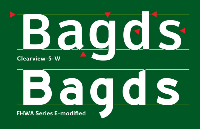
Clearview (above) retools FHWA Series E, or Highway Gothic (below), to allow for clearer reading of letter and word shapes at the furthest point possible for normal vison. Photo credit: The T.D. Larsen Transportation Institute, Pennsylvania State University.
When we’re talking about a 10 x 16 sign and the letters are 2 to 3 feet tall, I’m not sure anyone other than a designer would notice the difference between fonts. Or would they? Next time you look up to take an exit and make that wrong turn, think about the sign you just saw. Did you get lost because your GPS misdirected you, or did the exit sign throw you off?
To find out how TalentMEDIA Services, a Capitol Communicator sponsor, can help you with design services such as desktop publishing, graphic design, website design, or 508 compliance and remediation, contact Johanna Daproza, Director of Creative Services at TalentMEDIA Services at [email protected].


0 Comments